
Reimagining Conference Experience: Creating a Web-Based App on a Budget
Each year, Campus Outreach hosts a large conference for 900 students and staff where they provide a mobile app to create a seamless attendee experience. The app serves as the central hub for accessing schedules, maps, and other essential resources.
In 2021, I was tasked with developing the app under new constraints while maintaining its quality and user experience. This challenge presented an opportunity for me to redesign the app.
My Role
I led this project from design through development, working closely with the conference director and collaborating with staff members to gather information and receive feedback before launch.
Although I had complete responsibility and decision-making authority for this app, this case study will focus primarily on the design process.
The Problem
We used to hire a developer to build our conference app for under $1,000, but their solution was buggy and lacked time-sensitive customer support. So we explored other solutions, and I suggested using Webflow, as we already had a subscription. This would save us money and have complete control of the functionality and app design, but it meant sacrificing features like offline mode and push notifications. The conference director agreed it was worth the trade-off.
Now that we have full control over the web app's design in Webflow, let's examine the previous app and identify opportunities for improvement.
Evaluating the previous app design


Evaluation summary
Poor visual design
The old app lacked visual appeal, featuring a dense text layout, minimal visual hierarchy, and few images showing people or activities, making the content difficult to scan and unappealing to users.
No relevancy
Upon opening the app, users encounter non-essential content rather than the most important and frequently needed information. Users may miss important events or resources and spend extra time finding frequently accessed content.
Clean navigation
The bottom toolbar effectively organizes content into clear categories, making it simple for users to locate what they need.
Clear schedule layout and categorization
The schedule page presents events in a clean, logical layout and includes helpful tabs for filtering events by category.
UX research
To better understand the user needs and pain points, I conducted several research activities:
- Analyzed feedback from previous conference apps (2018-2020)
- Interviewed the conference director (stakeholder) to understand goals and requirements
- Interviewed 3 staff members who managed the previous conference
Key findings from the research revealed both successful features and areas for improvement:
| Useful Features | Wishlist |
|---|---|
|
|
Defining the Problem ✨
How might we redesign the app for a better user experience?
Goals
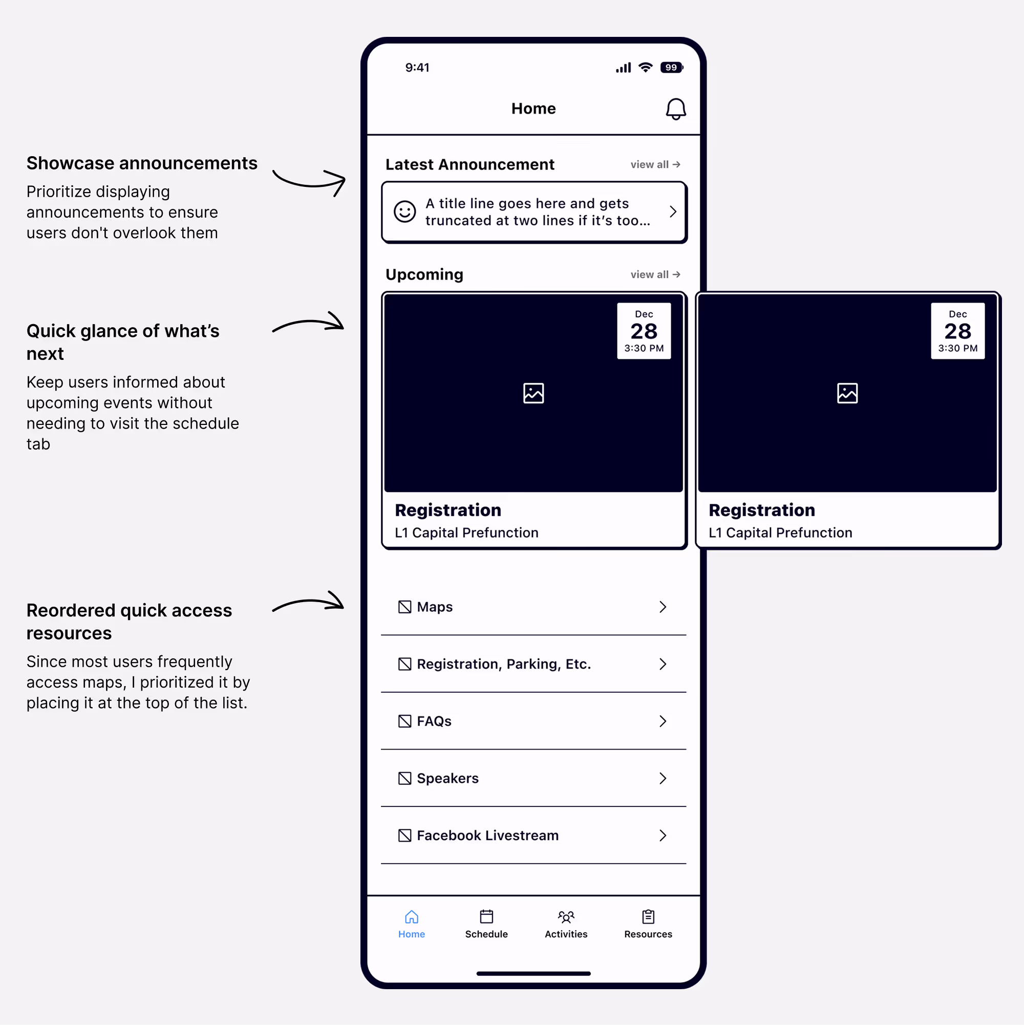
Highlight important content
To display the most important and relevant content on the home page, allowing users to access frequently needed information without extra navigation steps.
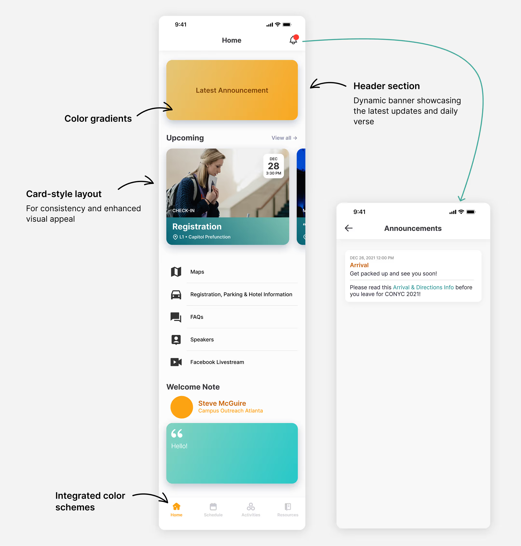
A delightful experience
Create a more personal experience through a refreshed visual design and additional imagery
Business Goal
Operational efficiency
To streamline internal operations by designing a reusable app template with modular components for future conferences
Process
Early designs
I created wireframes to restructure the layouts for better readability and user experience.
Home tab
Schedule tab

Prototyping & Final Designs
Since I was working alone and needed to get this built quickly and start the development process, I skipped creating wireframes for the other pages and started making prototypes.
Home tab
Maps page

Schedule tab

Event page

Suggested local places

Design system

Impact
User feedback
The web app was extremely well-received, praised for its usability, aesthetics, and functionality, with only minor, actionable suggestions. It significantly enhanced attendees' overall experience.
Ease of use & navigation: attendees consistently found it intuitive and well-organized.
“Super helpful and easy to navigate”
“Always had the info I was looking for”
Centralized information: Attendees appreciated having everything in one place
“So clear and everything in one place”
Positive experience: Many said it enhanced their overall conference experience
“Amazing!”, “10/10”, “Perfect”, “UNREAL!!! So good”
“Well done! Run it back”
Saved time and money
Since the app was designed as a scalable template for future use, it saved the organization time, energy, and money in the next few years.
Learnings
- Simple, responsive web apps can deliver high value when well-designed
- Planning for reusability is crucial for long-term success
Future
The app was a success, but we've got some ideas for making it even better.
Detailed feedback plan
Gather more specific feedback to help us fine-tune the design in meaningful ways in the future.
Bring back useful features
Features like push notifications and personalized agendas would enhance the app's usefulness, but these are currently beyond our budget and platform capabilities. To implement these features, the organization would need to increase funding and adopt a different technical solution.